More on Child Abuse
A while back, I did a blog entry about child abuse and how it correlates with political leaning. I made a promise at the end of that piece that I would dig a little deeper. You can check on the study above if you want the full scoop, but it boils down to this: in counties Trump won, child abuse was more rampant. It varied from county to county, but on the surface, it appears that Trump counties at the very least aren’t effective at stopping child abuse. But…I admitted there and I further admit here that there were a bunch of caveats. First, some states have so few counties that the correlation analysis I did wasn’t as reliable. Even for those with many states, the many of the correlations were not what we would call “significant.” That is to say, 0.6 or higher is considered significant (as a rule of thumb) when we’re talking about correlation.
That said, to see the same pattern play out again and again across multiple states…well, there’s clearly something happening there. This brings me to the second problem: if there is a shared variable that both causes high Republican voter participation and also causes frequent child abuse. All of the states in which the problem counties existed were red states, and generally red states are less wealthy than blue ones (not a judgment, just a fact). So I guessed that maybe poverty or lower income contributes. I wanted to look at it, so I set up another correlation analysis. Note that I do understand that there are more definitive types of statistical measures and that I’m just trying to get a feel for the data at the moment and share what I find along the way. Eventually, once I have a good lead, I’ll bring out the “big guns.” Here’s a chart of what I found.
The Chart
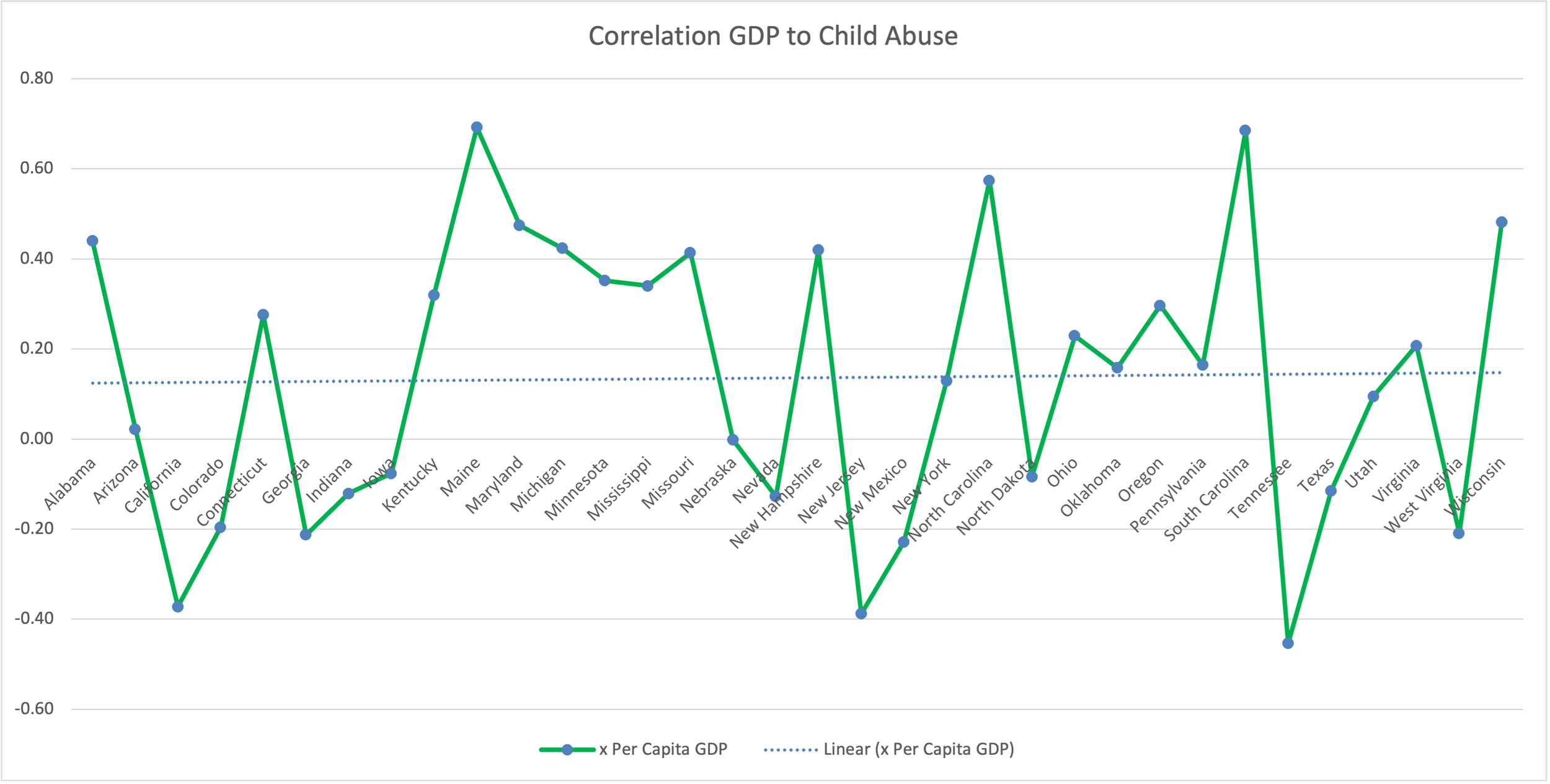
Correlations between GDP per capita and incidents of child abuse, by state.
So…let’s discuss. This graph does actually a few things. I assumed that per-capita GDP is a good metric to use as a swag for how wealthy the members are. This isn’t absolutely true, but is close enough to feel out the data.
First, look at that blue dotted line behind the solid green line. See how it’s almost straight across and hovering at about the 0.2 mark? You could consider the 0.2 to indicate that there’s an ever-so-slight correlation to be teased out. Basically, the more per-capita GDP your counties have, the (slightly) higher your child abuse reports. That’s interesting to me, because I would have guessed the opposite. So what’s going on?
Well, the GDP per-capita for my calculation is simply the GDP of the county divided by the number of residents in that county. My correlation analysis was across all the states, but comparing the counties to each other within the states. In other words, my analysis wasn’t telling me about GDP per capita generally, but was telling me within a specific state, GDP per capita trending upward weakly correlates with incidents of child abuse in that state. Taking a closer look at the results, you see that this correlation only seems to hold for some states.
The Gini
So I began thinking more on the topic. Why? I must have been missing something. It hit me then: it was a greedy (naive) approach to divide the GDP by the populations. If the income was inequally distributed, then that wouldn’t mean that most individuals benefit from that higher GDP. If only there was a way to measure inequality…
There is! It’s called the GINI index, and it measures income inequality (an international standard). It just so happens that these can also be done on the county level, and were done by U.S. Census Bureau at that level. Have a look for yourself, it’s a downloadable PDF. Wait, I think I can share that ok. Here. This is measure from 0 to 1, 0 being absolutely everyone makes the same, and 1 meaning a single person hoards all the wealth.

GINI coefficient county map. Dark blue represent areas of higher income inequality, lighter colors represent areas of lower income inequality.
What do you notice above? I noticed that it lines up pretty well with my correlations. I haven’t taken it down to a county level yet, but certainly the states with the most income inequality seem to have higher levels of child abuse.
And now my next study is born. I intend to look at that correlation next. Which in itself will be pretty interesting, I think. Don’t you? As usual, check for yourself. Here’s all my data.
The Data
You can download all the data for this one, as it’s publicly available online. Here’s my version of the data (but you can go to the original sites for the same - sources are in the spreadsheet).